Iterative Design, Prototyping
Simplifying University's Event Reservations Portal

Overview
As a part of one of my core classes in the MS-HCI program, ‘Information and Interaction Design’, students were divided into teams and tasked to rework a website or an app flow they thought could be improved. We chose RIT's facility reservation website- RIT Events for this.
Deliverables: User Research, Competitive Analysis, User-flows, Wireframes, Mockups, User Testing results
My Role
While working as part of a team of 3 —2 MS HCI students, 1 MFA student— to redesign the overall website, we all contributed to each phase of the project, research, ideation, visual design. However, my major focus was on redefining and validating the user flow before moving to final designs.

Outcome
38% increase in efficiency
Decreased the total number of steps to complete tasks like booking a facility.
50% increase in user satisfaction
Post task survey indicated users preferred the redesigned website.
Problems in current design
We started the project by analyzing the existing flow and conducting a quick heuristic evaluation to discover any critical and obvious usability problems. In order to validate our findings, we conducted usability test with 8 participants. The following problems were found:
01
Complex Navigation
Poor organization of reservation templates
Elements scattered across different pages
Lack of flexibility to modify bookings
02
Confusing User flow
The system requires multiple(7-8) steps to complete a simple room booking
Redundant steps including pages and actions
03
Outdated design
Cluttered layout
Multiple CTA buttons
Delayed feedback for errors

The users of the website
The users include students, faculty and staff, student organizations, and event coordinators. Each user group has different needs, but they all require an easy, flexible, and efficient booking process. To understand end ensure the design aligns with users' end goals, we defined JTBD statements for each of the user group.

Understanding the current system
We read the documentation of the system and talked to RIT's IT team to understand the "why" behind certain limitations we noticed during the research. We kept these limitations in mind during our redesign process to make it more realistic.
Study rooms can be booked in 1 hour slots at a time.
This was done to avoid students hogging the study rooms by booking them back-to-back and make it accessible to everyone.
Templated are defined by the org using the system.
The templates basically determine the flow of the system based on the option users select.
Only 4 bookings are allowed in a day across the system.
This was again done to avoid students misusing the system and giving everyone an opportunity to reserve facilities.
Industry Analysis
An industry analysis of current booking websites helped us understand the industry best standards, visual design pattens, and user flows for different booking processes. The main observation was use of progressive disclosure and flexibility on these websites so that the user is not overwhelmed with information and form fields.

Design Goals
We defined goals after careful consideration of the research findings and industry analysis. Defining these goals helped focus on the optimal level of structure and the flow of the website.
01
Flexible
Improve filtering, categorization, and labeling to help users find information faster.
02
Simple
Streamline the booking process and help users easily complete their tasks.
03
Coherent
Focusing on user jobs and workflows by enhancing hierarchy and improving usability.
Design Approach
01
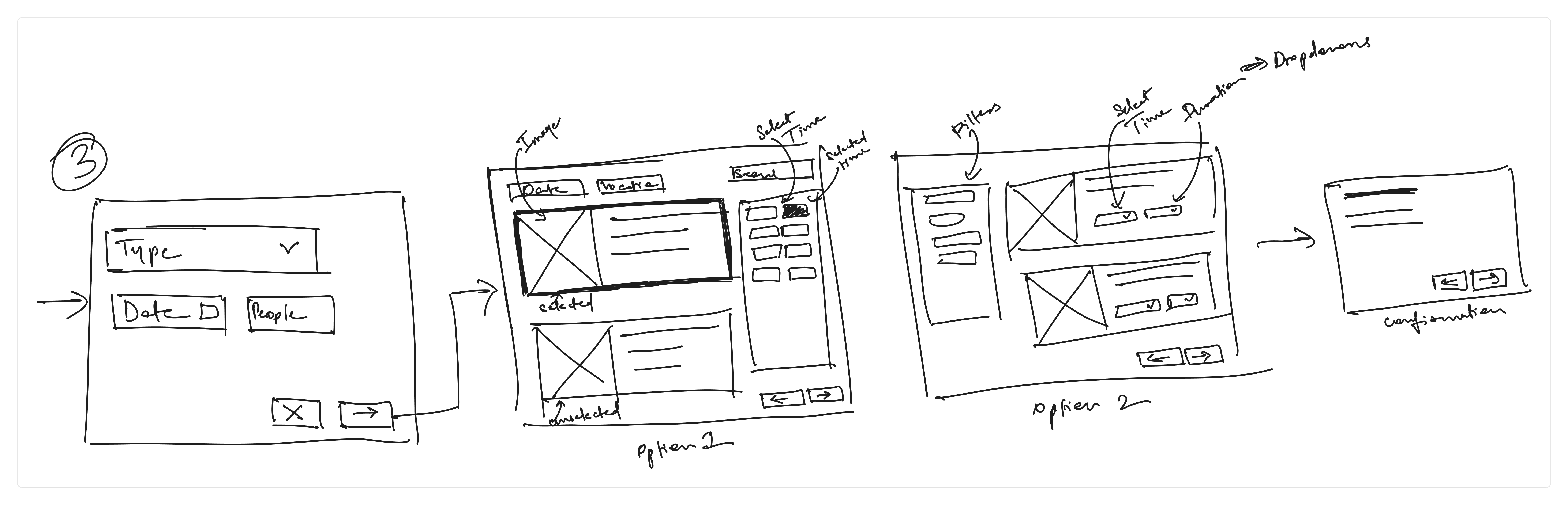
Establishing better user-flows
Based on the research, we started designing the basic user flow for the most complex booking flow, and simplifying it for less complex task like booking a study room. We outlined the major steps and pages that user will go through, before going into the details. We were able to decrease the number of steps taken to book a facility from min of 8 to 6 overall.


02
Reducing redundancies
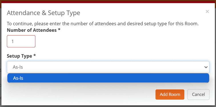
The current user flow contains many redundant steps the user has to go through. For example, users are prompted to select a setup type even when it wasn’t available. To improve usability, we modified the flow so that the setup selection is only required when the chosen reservation type supports it; otherwise, the option remains inactive.

03
Intuitive Interface
For an intuitive navigation experience, we combined elements that were scattered throughout one or multiple pages. For example, the current "My Bookings" page does not have a coherent calendar which makes it difficult to navigate. We replaced the elements with a dedicated calendar for easy navigation and more flexibility.
We also added edit and delete options for each element of the list, which allows user to modify an existing booking with fewer clicks making the process more efficient giving users more control.


Final Results
Simple and coherent experience
Based on the research, I started designing the basic user flow to book a facility and edit a booking. The goal was to minimize the number of steps while avoiding major structural changes and maintaining the same sequence of tasks. For this, I removed any redundant steps, and combined and/or split page elements as required to make the navigation intuitive.

Reflection
What did I learn from this project?
Our primary objective was to uphold the essence of the current website and RITs brand, and focus on refining and optimizing the elements that resonated well with users while simplifying areas that detracted from their overall experience.
I developed a design strategy that focused on achievable improvements while considering the practical implications of implementation. This approach ensured that my design decisions were not only desirable from a user experience perspective but also feasible within the context of the operational and technical realities.
© Framer Inc. 2023